
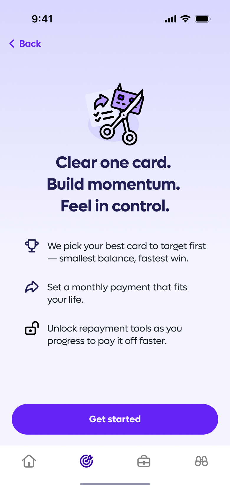
Clear One Card Repayment Plan
A guided repayment tool that reduces complexity and increases the number of CPay users actively paying down their credit card debt.
of users created a repayment plan with at least the recommended monthly payment — and said they'd do the same in a live app.
60%
KPI 1 - Recommended repayment plan adoption
of users set up spending round-ups to passively clear debt faster, understood how it worked — and said they'd use it in a live app.
60%
KPI 2 - Round-ups repayment activation
Thresholds: Success ≥ 70% | Accept 55–69% | Fail < 55%
Threshold: Pass ≥ 60% | Fail < 60%
Project Overview
Duration:
6 weeks
Type:
Freelance
Company:
CPay
Role:
Lead Product Designer
Deliverables:
Research and synthesis, design development and delivery
Collaborators:
Product Manager, Founder
Approach:
Double Diamond
Company Context
- CPay is a fintech startup rethinking how people manage credit card debt
- Their mission is to make borrowing fairer and less overwhelming through Open Banking and intelligent automation
- The product is an AI-powered app that connects your credit cards, analyses your spending and repayment patterns, and recommends smarter ways to get out of debt faster
Problem Statement
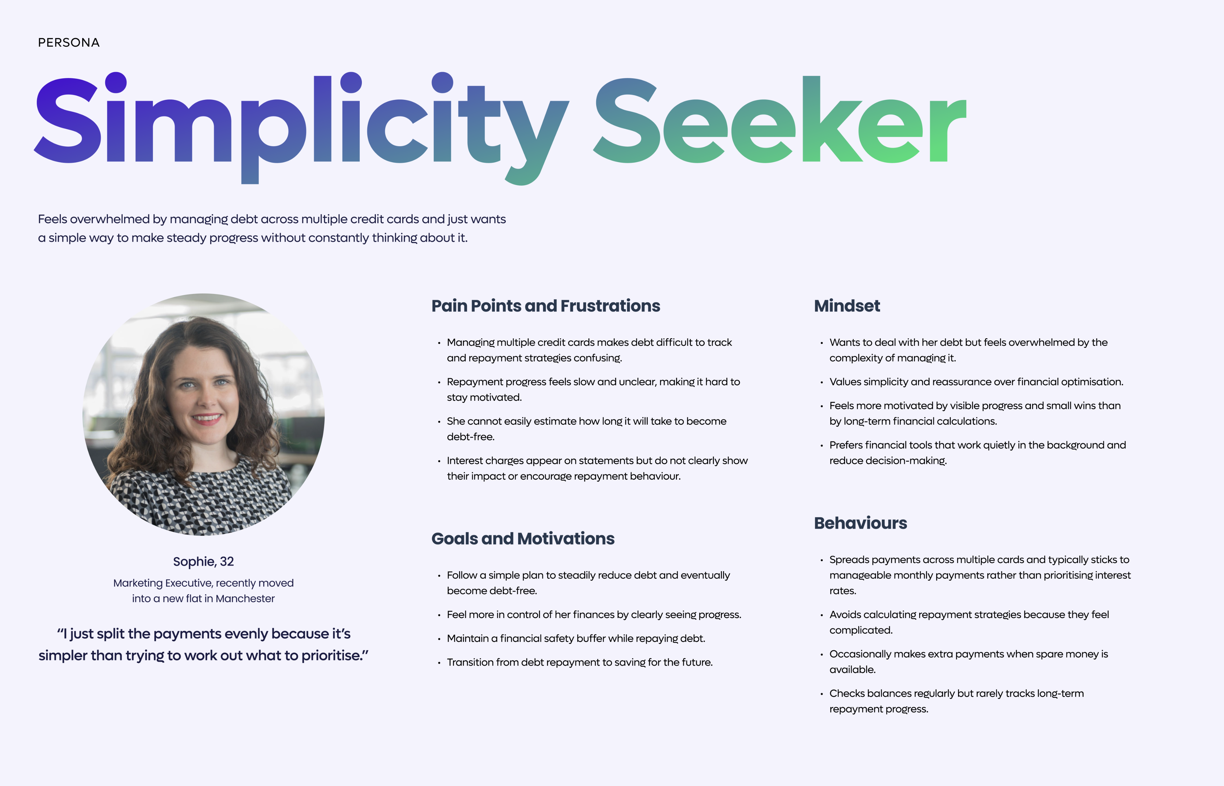
Someone managing multiple debts needs a way to confidently decide how to allocate repayments, so they can steadily reduce what they owe — without it becoming an overwhelming mental exercise.
Goals
Business
Reduce interest paid per user and improve repayment completion rates
Design
Make repayment plans easy to understand, build user confidence, and feel satisfying to set up
Success Metrics
Business
Reduce interest paid per user and improve repayment completion rates
Design
Make repayment plans easy to understand, build user confidence, and feel satisfying to set up
My Role
- Owned the design end-to-end, from early research to production-ready assets
- Worked closely with the PM to agree on success metrics upfront
- Ran workshops and regular stakeholder check-ins to keep everyone aligned
- Presented decisions to senior leadership and iterated based on their feedback
Process
- Interviewed stakeholders to understand the brief and align on goals
- Spoke with 12 users to uncover their real pain points
- Ran affinity mapping and built a persona to define the core problem
- Benchmarked 5+ competitors to spot gaps and opportunities
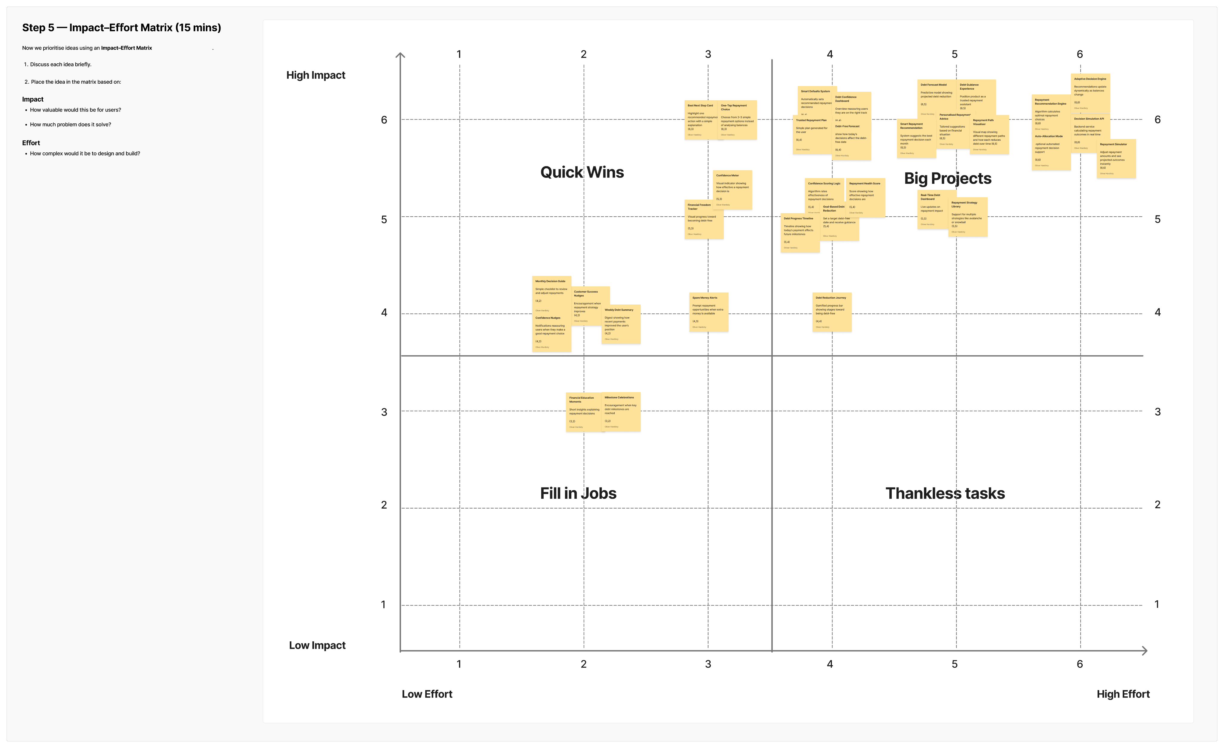
- Ran HMW workshops with the team to explore and prioritise ideas
- Tested designs with users across 2 rounds, iterating on findings
Problem Research
Key Research Insights
Insight 1
Simplicity beats strategy
Users default to easy repayment patterns to avoid cognitive load.
Evidence
Participants split payments evenly rather than comparing interest rates.
Insight 2
No clear debt end date
Payoff timelines feel too complex to calculate.
Evidence
Most participants had never estimated time to full repayment.
Insight 3
Progress drives motivation
Visible milestones keep users engaged and on track.
Evidence
Participants described motivation from watching balances shrink.
Insight 4
Interest feels abstract
Monthly charges feel too small to act on.
Evidence
Participants noticed interest but rarely adjusted behaviour in response.
Insight 5
Financial safety first
Savings buffers feel safer than accelerating repayment.
Evidence
Participants limited payments to protect a savings cushion.
key Research Deliverables
Persona
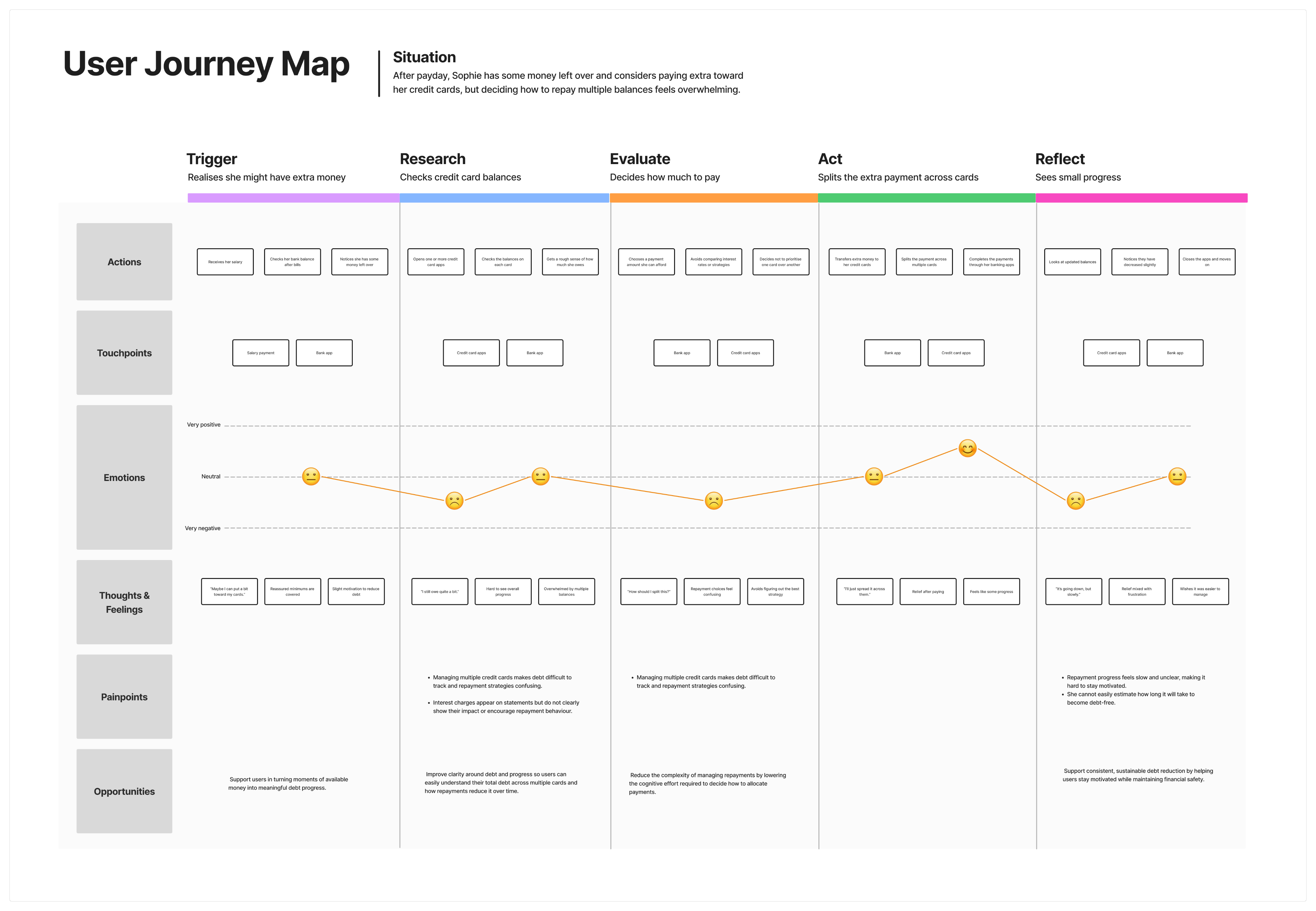
As-Is User Journey Map
Design Ideation
Lorem
[Caption]
[Caption]
[Caption]
[Caption]
Hypothesis
Subtitle
We believe that ....
By providing clear repayment guidance and showing the impact of repayment decisions, for the Simplicity Seeker, we will enable them to make confident repayment decisions with less cognitive effort.
We will know this to be true when we see ...
- Users following the recommended repayment option
- Users reporting that the repayment process feels easy to understand
- Users reporting higher confidence in their repayment choices
User Flows
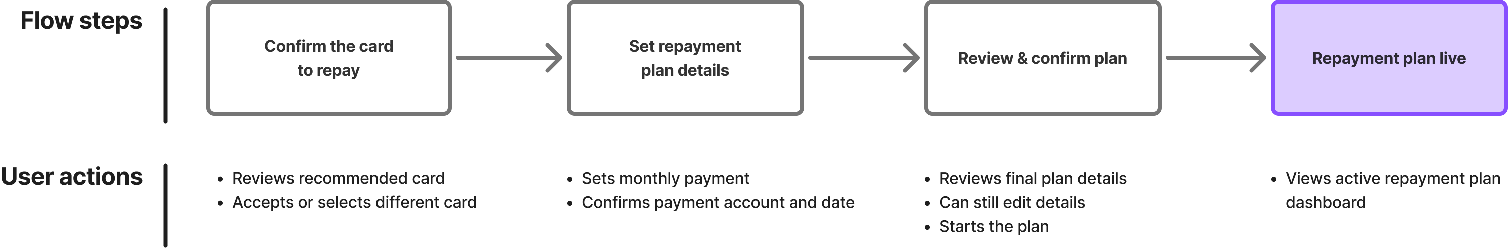
Create Repayment Plan - High-level flow
Create Repayment Plan - User flow
Prototyping &
Iterating
Prototype Usability Testing
Ran unmoderated remote usability testing using 5 screened participants. The test included:
- 2 prototype tasks: creating a repayment plan and activating round-up repayments.
- Post-task survey per prototype capturing ease of use, behavioural intent, and comprehension.
Subtitle
of users created a repayment plan with at least the recommended monthly payment — and said they'd do the same in a live app.
60%
KPI 1 - Recommended repayment plan adoption
of users set up spending round-ups to passively clear debt faster, understood how it worked — and said they'd use it in a live app.
60%
KPI 2 - Round-ups repayment activation
Thresholds: Success ≥ 70% | Accept 55–69% | Fail < 55%
Threshold: Pass ≥ 60% | Fail < 60%
Design Issues & Successes

design issue
Multi-card anxiety unresolved
One card targeted, others ignored — multi-card users feel partially addressed.
design issue
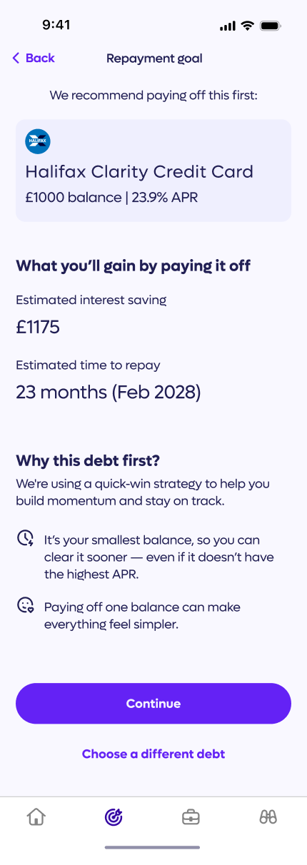
Repayment Goal payoff date appears absolute
"23 months (Feb 2028)" is presented as fixed before the user has set their payment amount.

design success
Finish-date framing lands consistently
Payoff dates outperform interest savings as the primary motivator across all users.
design success
Snowball rationale resolves "why this card"
"Why this debt first?" pre-empts the most common objection before users ask it.
design issue
Slider default anchors payment too low
£30 default and surplus overlay's worst-month figure pull cautious users below the 24-month payoff threshold.
design success
Surplus framing reduces perceived cost
Framing £55 as 31% of existing surplus positions the increase as reallocation, not new expenditure.
design success
Pre-filled defaults remove friction
Intelligent account and date pre-selection makes the payment settings screen effectively invisible.
design success
Safety buffer framing outperforms restriction language
"Leaves a buffer" positions the cap as protective
design issue
Review screen lacks payoff date
The strongest motivator is absent at the final commitment moment.
design success
No payment authority confirmation
Account and payment details collected with no explicit confirmation of what's been authorised.
design issue
Dashboard placeholders undermine confirmation moment
Templated values at plan creation signal incompleteness at the most critical retention moment.
design success
Stability phase milestone is concrete and actionable
£250 near-term target chunks a multi-year repayment into a visible first goal.
design success
Playbook structure signals progression without overwhelming
Locked future phases generate curiosity, not anxiety.
Prototypes
Vibe coded with Figma Make to maximise realism and validity of insights.
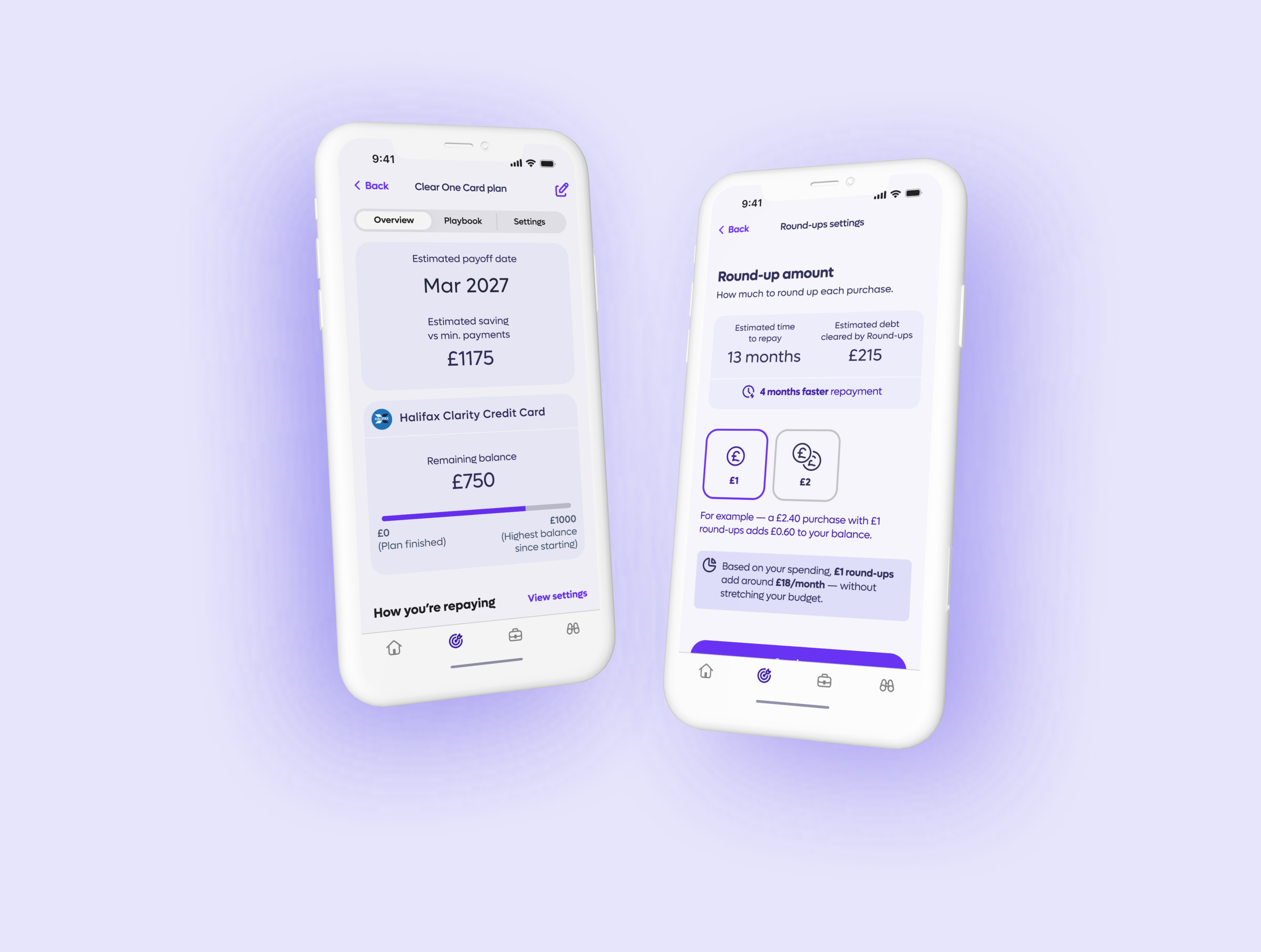
Create Repayment Plan (KPI 1)
Prototype
Video
Activate Round-ups (KPI 2)
Prototype
Video
Outcomes & Lessons
Impact
All results were drawn from the final round of usability testing on fully coded prototypes — the most realistic signal of how the design performs in practice.
of users created a repayment plan with at least the recommended monthly payment — and said they'd do the same in a live app.
60%
Recommended repayment plan adoption
KPI 1
- Plan created with at least the recommended monthly payment amount
- Payoff date correctly identified
- Behavioural intent rated ≥ 4/5
Thresholds: Success ≥ 85% | Accept 70–84% | Fail < 70%
Conditions required to include users in the result:
of users set up spending round-ups to passively clear debt faster, understood how it worked — and said they'd use it in a live app.
60%
Round-ups repayment activation
KPI 2
- Round-ups set up for their plan
- How the feature works correctly explained
- Behavioural intent rated ≥ 4/5
Conditions required to include users in the result:
Threshold: Pass ≥ 60% | Fail < 60%
Key Learnings
Through this project, I particularly learnt the value of the following:
Aligning through stakeholder interviews
Interrogated briefs and aligned on client expectations before diving into design.
Grounding decisions in personas
Synthesised research to keep design choices focused and user-centred.
Defining success metrics
Set considered metrics upfront to drive iteration and measure outcomes.
Vibe coding for insight
Used vibe coding to surface meaningful patterns from user testing sessions.
If you like what you see
— Don’t be a stranger! ...
o.hardisty@me.com


Clear One Card Repayment Plan
A guided repayment tool that reduces complexity and increases the number of CPay users actively paying down their credit card debt.
of users created a repayment plan with at least the recommended monthly payment — and said they'd do the same in a live app.
60%
KPI 1 - Recommended repayment plan adoption
of users set up spending round-ups to passively clear debt faster, understood how it worked — and said they'd use it in a live app.
60%
KPI 2 - Round-ups repayment activation
Thresholds: Success ≥ 70% | Accept 55–69% | Fail < 55%
Threshold: Pass ≥ 60% | Fail < 60%
Project Overview
Duration:
6 weeks
Type:
Freelance
Company:
CPay
Role:
Lead Product Designer
Deliverables:
Research and synthesis, design development and delivery
Collaborators:
Product Manager, Founder
Approach:
Double Diamond
Company Context
- CPay is a fintech startup rethinking how people manage credit card debt
- Their mission is to make borrowing fairer and less overwhelming through Open Banking and intelligent automation
- The product is an AI-powered app that connects your credit cards, analyses your spending and repayment patterns, and recommends smarter ways to get out of debt faster
Problem Statement
Someone managing multiple debts needs a way to confidently decide how to allocate repayments, so they can steadily reduce what they owe — without it becoming an overwhelming mental exercise.
Goals
Business
Reduce interest paid per user and improve repayment completion rates
Design
Make repayment plans easy to understand, build user confidence, and feel satisfying to set up
Success Metrics
Business
Reduce interest paid per user and improve repayment completion rates
Design
Make repayment plans easy to understand, build user confidence, and feel satisfying to set up
My Role
- Owned the design end-to-end, from early research to production-ready assets
- Worked closely with the PM to agree on success metrics upfront
- Ran workshops and regular stakeholder check-ins to keep everyone aligned
- Presented decisions to senior leadership and iterated based on their feedback
Process
- Interviewed stakeholders to understand the brief and align on goals
- Spoke with 12 users to uncover their real pain points
- Ran affinity mapping and built a persona to define the core problem
- Benchmarked 5+ competitors to spot gaps and opportunities
- Ran HMW workshops with the team to explore and prioritise ideas
- Tested designs with users across 2 rounds, iterating on findings
Problem Research
Key Research Insights
Insight 1
Simplicity beats strategy
Users default to easy repayment patterns to avoid cognitive load.
Evidence
Participants split payments evenly rather than comparing interest rates.
Insight 2
No clear debt end date
Payoff timelines feel too complex to calculate.
Evidence
Most participants had never estimated time to full repayment.
Insight 3
Progress drives motivation
Visible milestones keep users engaged and on track.
Evidence
Participants described motivation from watching balances shrink.
Insight 4
Interest feels abstract
Monthly charges feel too small to act on.
Evidence
Participants noticed interest but rarely adjusted behaviour in response.
Insight 5
Financial safety first
Savings buffers feel safer than accelerating repayment.
Evidence
Participants limited payments to protect a savings cushion.
key Research Deliverables
Persona
As-Is User Journey Map
Design Ideation
Lorem
[Caption]
[Caption]
[Caption]
[Caption]
Hypothesis
Subtitle
We believe that ....
By providing clear repayment guidance and showing the impact of repayment decisions, for the Simplicity Seeker, we will enable them to make confident repayment decisions with less cognitive effort.
We will know this to be true when we see ...
- Users following the recommended repayment option
- Users reporting that the repayment process feels easy to understand
- Users reporting higher confidence in their repayment choices
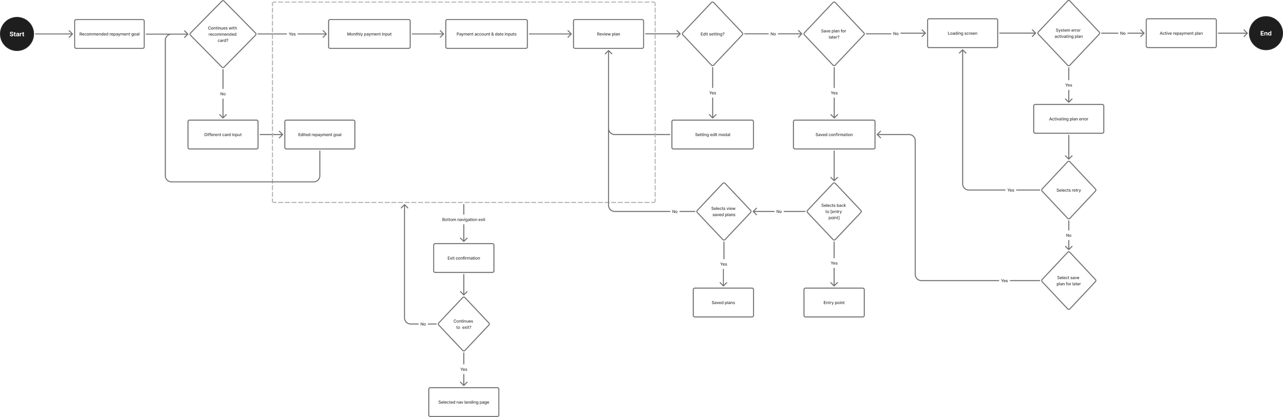
User Flows
Create Repayment Plan - High-level flow
Create Repayment Plan - User flow
Prototyping &
Iterating
Prototype Usability Testing
Ran unmoderated remote usability testing using 5 screened participants. The test included:
- 2 prototype tasks: creating a repayment plan and activating round-up repayments.
- Post-task survey per prototype capturing ease of use, behavioural intent, and comprehension.
Subtitle
of users created a repayment plan with at least the recommended monthly payment — and said they'd do the same in a live app.
60%
KPI 1 - Recommended repayment plan adoption
of users set up spending round-ups to passively clear debt faster, understood how it worked — and said they'd use it in a live app.
60%
KPI 2 - Round-ups repayment activation
Thresholds: Success ≥ 70% | Accept 55–69% | Fail < 55%
Threshold: Pass ≥ 60% | Fail < 60%
Design Issues & Successes
design issue
Multi-card anxiety unresolved
One card targeted, others ignored — multi-card users feel partially addressed.
design issue
Repayment Goal payoff date appears absolute
"23 months (Feb 2028)" is presented as fixed before the user has set their payment amount.
design success
Finish-date framing lands consistently
Payoff dates outperform interest savings as the primary motivator across all users.
design success
Snowball rationale resolves "why this card"
"Why this debt first?" pre-empts the most common objection before users ask it.
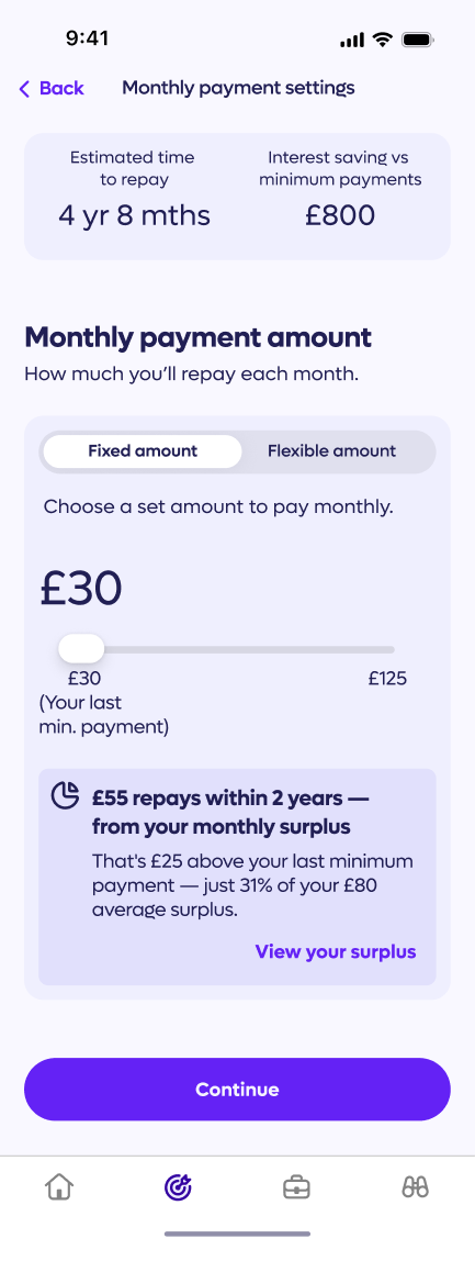
design issue
Slider default anchors payment too low
£30 default and surplus overlay's worst-month figure pull cautious users below the 24-month payoff threshold.
design success
Surplus framing reduces perceived cost
Framing £55 as 31% of existing surplus positions the increase as reallocation, not new expenditure.
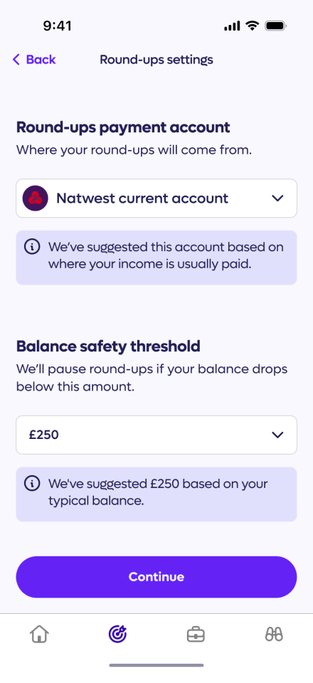
design success
Pre-filled defaults remove friction
Intelligent account and date pre-selection makes the payment settings screen effectively invisible.
design success
Safety buffer framing outperforms restriction language
"Leaves a buffer" positions the cap as protective
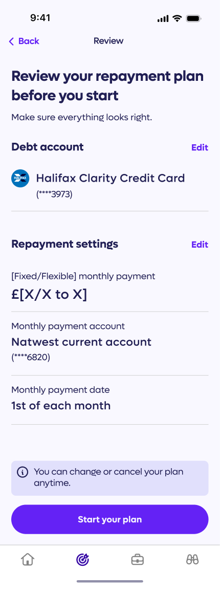
design issue
Review screen lacks payoff date
The strongest motivator is absent at the final commitment moment.
design success
No payment authority confirmation
Account and payment details collected with no explicit confirmation of what's been authorised.
design issue
Dashboard placeholders undermine confirmation moment
Templated values at plan creation signal incompleteness at the most critical retention moment.
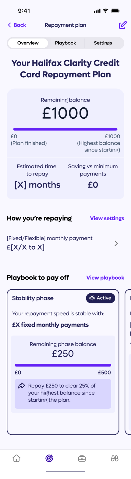
design success
Stability phase milestone is concrete and actionable
£250 near-term target chunks a multi-year repayment into a visible first goal.
design success
Playbook structure signals progression without overwhelming
Locked future phases generate curiosity, not anxiety.
Prototypes
Vibe coded with Figma Make to maximise realism and validity of insights.
Create Repayment Plan (KPI 1)
Prototype
Video
Activate Round-ups (KPI 2)
Prototype
Video
Screen Flow Diagrams
Hover the screen flows to take a closer look
Create Repayment Plan
Happy path only

Click to zoom in and out
Activate Round-ups
Happy path only
Click to zoom in and out
Outcomes & Lessons
Impact
All results were drawn from the final round of usability testing on fully coded prototypes — the most realistic signal of how the design performs in practice.
of users created a repayment plan with at least the recommended monthly payment — and said they'd do the same in a live app.
60%
Recommended repayment plan adoption
KPI 1
- Plan created with at least the recommended monthly payment amount
- Payoff date correctly identified
- Behavioural intent rated ≥ 4/5
Thresholds: Success ≥ 85% | Accept 70–84% | Fail < 70%
Conditions required to include users in the result:
of users set up spending round-ups to passively clear debt faster, understood how it worked — and said they'd use it in a live app.
60%
Round-ups repayment activation
KPI 2
- Round-ups set up for their plan
- How the feature works correctly explained
- Behavioural intent rated ≥ 4/5
Conditions required to include users in the result:
Threshold: Pass ≥ 60% | Fail < 60%
Key Learnings
Through this project, I particularly learnt the value of the following:
Aligning through stakeholder interviews
Interrogated briefs and aligned on client expectations before diving into design.
Grounding decisions in personas
Synthesised research to keep design choices focused and user-centred.
Defining success metrics
Set considered metrics upfront to drive iteration and measure outcomes.
Vibe coding for insight
Used vibe coding to surface meaningful patterns from user testing sessions.
If you like what you see — Don’t be a stranger! ...
o.hardisty@me.com

Clear One Card Repayment Plan
A guided repayment tool that reduces complexity and increases the number of CPay users actively paying down their credit card debt.
of users created a repayment plan with at least the recommended monthly payment — and said they'd do the same in a live app.
60%
KPI 1 - Recommended repayment plan adoption
of users set up spending round-ups to passively clear debt faster, understood how it worked — and said they'd use it in a live app.
60%
KPI 2 - Round-ups repayment activation
Thresholds: Success ≥ 70% | Accept 55–69% | Fail < 55%
Threshold: Pass ≥ 60% | Fail < 60%
Project Overview
Duration:
6 weeks
Type:
Freelance
Company:
CPay
Role:
Lead Product Designer
Deliverables:
Research and synthesis, design development and delivery
Collaborators:
Product Manager, Founder
Approach:
Double Diamond
Company Context
- CPay is a fintech startup rethinking how people manage credit card debt
- Their mission is to make borrowing fairer and less overwhelming through Open Banking and intelligent automation
- The product is an AI-powered app that connects your credit cards, analyses your spending and repayment patterns, and recommends smarter ways to get out of debt faster
Problem Statement
Someone managing multiple debts needs a way to confidently decide how to allocate repayments, so they can steadily reduce what they owe — without it becoming an overwhelming mental exercise.
Goals
Business
Reduce interest paid per user and improve repayment completion rates
Design
Make repayment plans easy to understand, build user confidence, and feel satisfying to set up
Success Metrics
Two KPIs were defined — one per prototype. Each KPI has three conditions, that had to be met simultaneously to count as a conversion.
KPI 1 — Recommended repayment plan adoptionPercentage of users who created a repayment plan that met the following conditions:
- Plan created with at least the recommended monthly payment amount
- Payoff date correctly identified
- Behavioural intent rated ≥ 4/5
Thresholds: Success ≥ 70% | Accept 55–69% | Fail < 55%
KPI 2 — Round-ups repayment activationPercentage of users who activated round-ups. A pass required:
- Round-ups set up for their plan
- How the feature works correctly explained
- Behavioural intent rated ≥ 4/5
Threshold: Pass ≥ 60% | Fail < 60%
My Role
- Owned the design end-to-end, from early research to production-ready assets
- Worked closely with the PM to agree on success metrics upfront
- Ran workshops and regular stakeholder check-ins to keep everyone aligned
- Presented decisions to senior leadership and iterated based on their feedback
Process
- Interviewed stakeholders to understand the brief and align on goals
- Spoke with 12 users to uncover their real pain points
- Ran affinity mapping and built a persona to define the core problem
- Benchmarked 5+ competitors to spot gaps and opportunities
- Ran HMW workshops with the team to explore and prioritise ideas
- Tested designs with users across 2 rounds, iterating on findings
Problem Research
Key Research Insights
Insight 1
Simplicity beats strategy
Users default to easy repayment patterns to avoid cognitive load.
Evidence
Participants split payments evenly rather than comparing interest rates.
Insight 2
No clear debt end date
Payoff timelines feel too complex to calculate.
Evidence
Most participants had never estimated time to full repayment.
Insight 3
Progress drives motivation
Visible milestones keep users engaged and on track.
Evidence
Participants described motivation from watching balances shrink.
Insight 4
Interest feels abstract
Monthly charges feel too small to act on.
Evidence
Participants noticed interest but rarely adjusted behaviour in response.
Insight 5
Financial safety first
Savings buffers feel safer than accelerating repayment.
Evidence
Participants limited payments to protect a savings cushion.
key Research Deliverables
Persona
As-Is User Journey Map
Design Ideation
Lorem
Ideation
Hypothesis
Subtitle
We believe that ....
By providing clear repayment guidance and showing the impact of repayment decisions, for the Simplicity Seeker, we will enable them to make confident repayment decisions with less cognitive effort.
We will know this to be true when we see ...
- Users following the recommended repayment option
- Users reporting that the repayment process feels easy to understand
- Users reporting higher confidence in their repayment choices
User Flows
Create Repayment Plan - High-level flow
Create Repayment Plan - User flow
Prototyping &
Iterating
Prototype Usability Testing
Ran unmoderated remote usability testing using 5 screened participants. The test included:
- 2 prototype tasks: creating a repayment plan and activating round-up repayments.
- Post-task survey per prototype capturing ease of use, behavioural intent, and comprehension.
Subtitle
of users created a repayment plan with at least the recommended monthly payment — and said they'd do the same in a live app.
60%
KPI 1 - Recommended repayment plan adoption
of users set up spending round-ups to passively clear debt faster, understood how it worked — and said they'd use it in a live app.
60%
KPI 2 - Round-ups repayment activation
Thresholds: Success ≥ 70% | Accept 55–69% | Fail < 55%
Threshold: Pass ≥ 60% | Fail < 60%
Design Issues & Successes
design issue
Multi-card anxiety unresolved
One card targeted, others ignored — multi-card users feel partially addressed.
design issue
Repayment Goal payoff date appears absolute
"23 months (Feb 2028)" is presented as fixed before the user has set their payment amount.
design success
Finish-date framing lands consistently
Payoff dates outperform interest savings as the primary motivator across all users.
design success
Snowball rationale resolves "why this card"
"Why this debt first?" pre-empts the most common objection before users ask it.
design issue
Slider default anchors payment too low
£30 default and surplus overlay's worst-month figure pull cautious users below the 24-month payoff threshold.
design success
Surplus framing reduces perceived cost
Framing £55 as 31% of existing surplus positions the increase as reallocation, not new expenditure.
design success
Pre-filled defaults remove friction
Intelligent account and date pre-selection makes the payment settings screen effectively invisible.
design success
Safety buffer framing outperforms restriction language
"Leaves a buffer" positions the cap as protective
design issue
Review screen lacks payoff date
The strongest motivator is absent at the final commitment moment.
design success
No payment authority confirmation
Account and payment details collected with no explicit confirmation of what's been authorised.
design issue
Dashboard placeholders undermine confirmation moment
Templated values at plan creation signal incompleteness at the most critical retention moment.
design success
Stability phase milestone is concrete and actionable
£250 near-term target chunks a multi-year repayment into a visible first goal.
design success
Playbook structure signals progression without overwhelming
Locked future phases generate curiosity, not anxiety.
Prototypes
Vibe coded with Figma Make to maximise realism and validity of insights.
Create Repayment Plan (KPI 1)
Prototype
Video
Activate Round-ups (KPI 2)
Prototype
Video
Screen Flow Diagrams
Hover the screen flows to take a closer look
Create Repayment Plan
Happy path only
Click to zoom in and out
Activate Round-ups
Happy path only
Click to zoom in and out
Outcomes & Lessons
Impact
All results were drawn from the final round of usability testing on fully coded prototypes — the most realistic signal of how the design performs in practice.
of users created a repayment plan with at least the recommended monthly payment — and said they'd do the same in a live app.
60%
Recommended repayment plan adoption
KPI 1
- Plan created with at least the recommended monthly payment amount
- Payoff date correctly identified
- Behavioural intent rated ≥ 4/5
Thresholds: Success ≥ 85% | Accept 70–84% | Fail < 70%
Conditions required to include users in the result:
of users set up spending round-ups to passively clear debt faster, understood how it worked — and said they'd use it in a live app.
60%
Round-ups repayment activation
KPI 2
- Round-ups set up for their plan
- How the feature works correctly explained
- Behavioural intent rated ≥ 4/5
Conditions required to include users in the result:
Threshold: Pass ≥ 60% | Fail < 60%
Key Learnings
Through this project, I particularly learnt the value of the following:
Aligning through stakeholder interviews
Interrogated briefs and aligned on client expectations before diving into design.
Grounding decisions in personas
Synthesised research to keep design choices focused and user-centred.
Defining success metrics
Set considered metrics upfront to drive iteration and measure outcomes.
Vibe coding for insight
Used vibe coding to surface meaningful patterns from user testing sessions.
If you like what you see — Don’t be a stranger! ...
o.hardisty@me.com